Sanderson Design Group
One design system, six heritage brands, two very different customers.
- Best eCommerce Replatform, eCommerce Awards 2026
- Silver, Best B2B Website of the Year
- Role
- Sole designer: research, UX, UI and design system
- Client
- Sanderson Design Group
- Agency
- Tom&Co
- Year
- 2025
- Scope
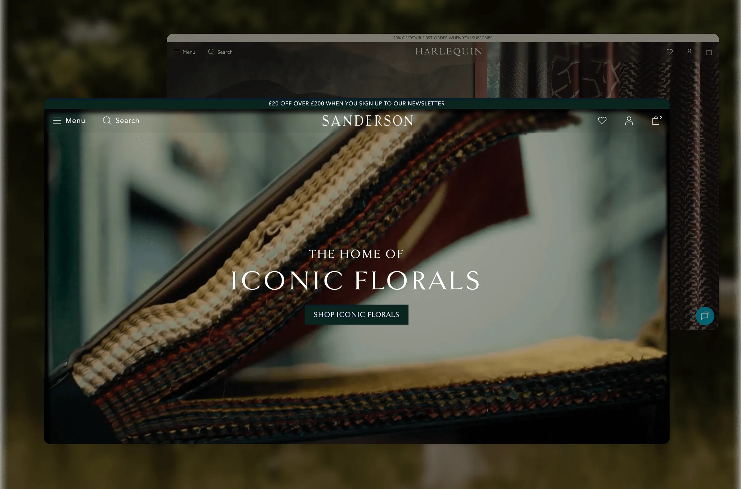
- B2B Trade Hub, Sanderson and Harlequin D2C sites, multi-brand design system
At a glance
- 6luxury brands unified in one trade platform
- 1design system built to carry every brand in the Group
- 1stdirect-to-consumer site for the Group, with Harlequin
- 2026Best eCommerce Replatform
The challenge
Sanderson Design Group has more than 160 years of design heritage, and its digital estate didn’t reflect any of it.
The trade site was essentially a single screen for SKU-based ordering. A designer with access to several of the Group’s brands had to jump between separate experiences to order and manage their account. There was no direct-to-consumer channel at all.
The brief had two parts. The first was a single trade hub that worked for professionals ordering at volume. The second was consumer sites that felt as considered as the fabrics and wallpapers they sell. Both had to run on one system the Group could roll out to every brand.
Starting at the factory
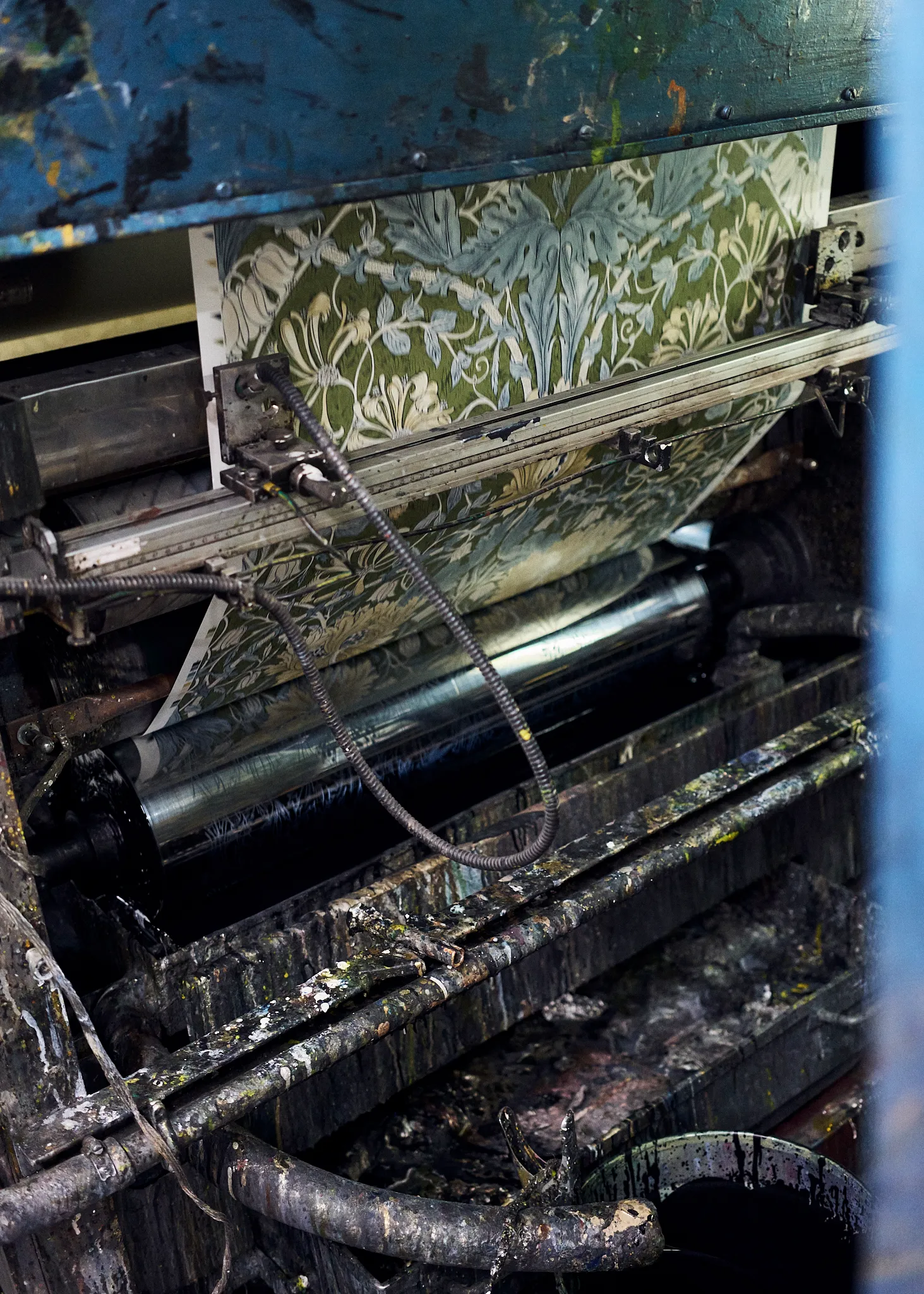
Before designing anything, I visited Sanderson’s factory and spent time with their in-house designers. Seeing how a pattern goes from archive drawing to printed roll shaped the whole visual direction: generous space, the product at full bleed, and restraint everywhere else. Luxury here meant letting the craft speak.


Key decisions
One system, many brands
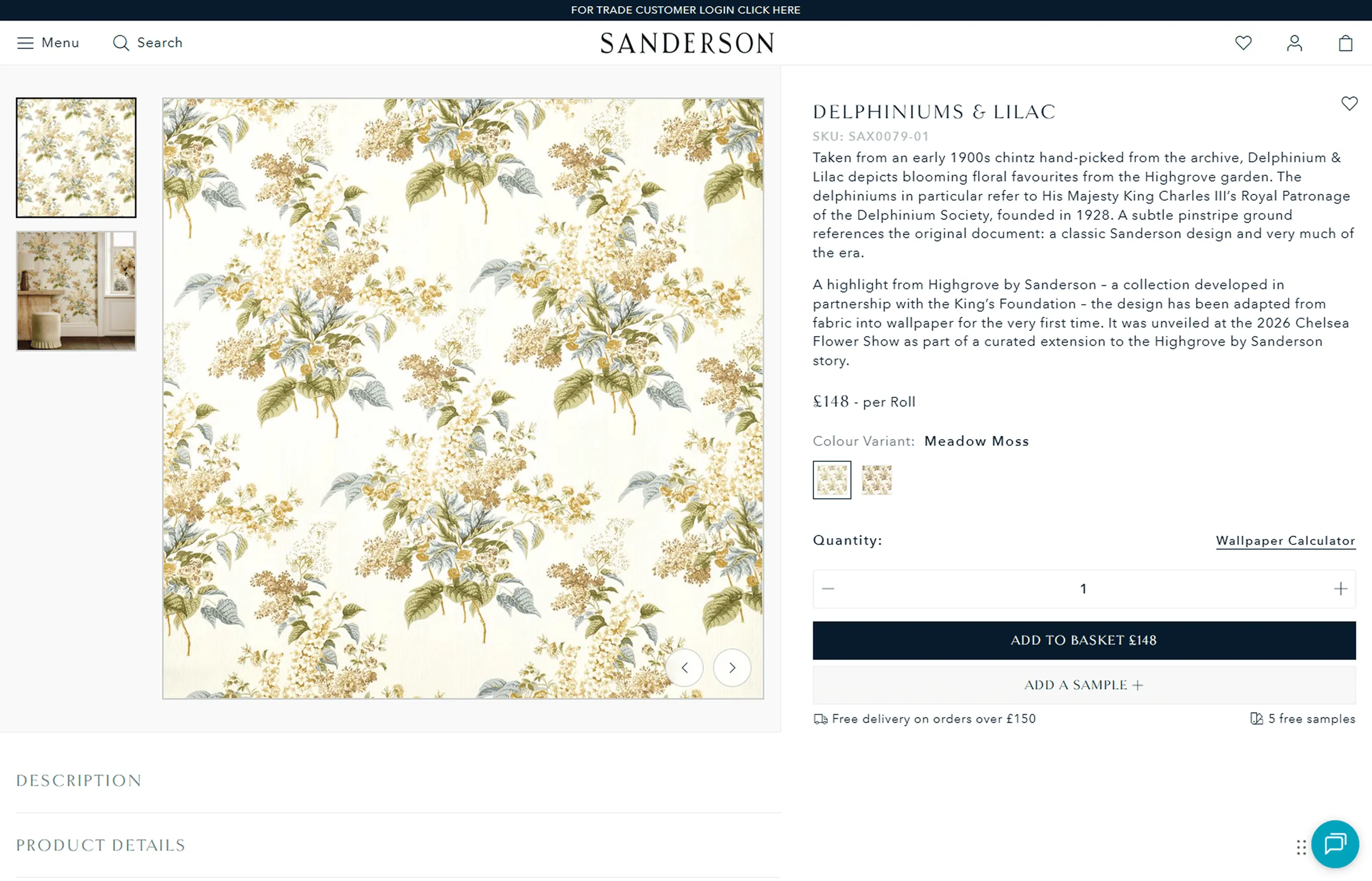
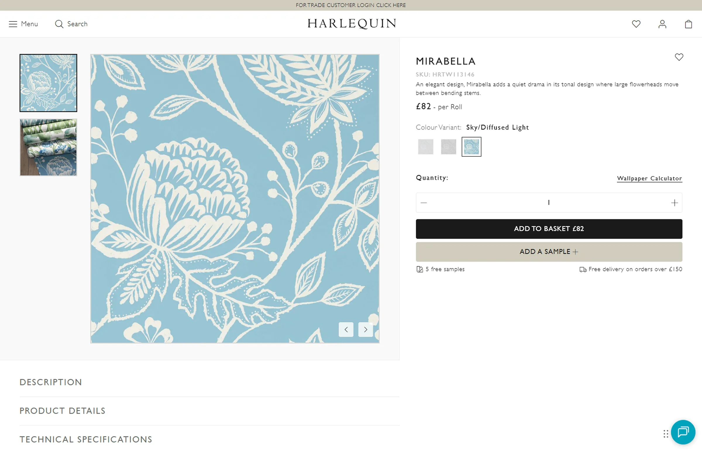
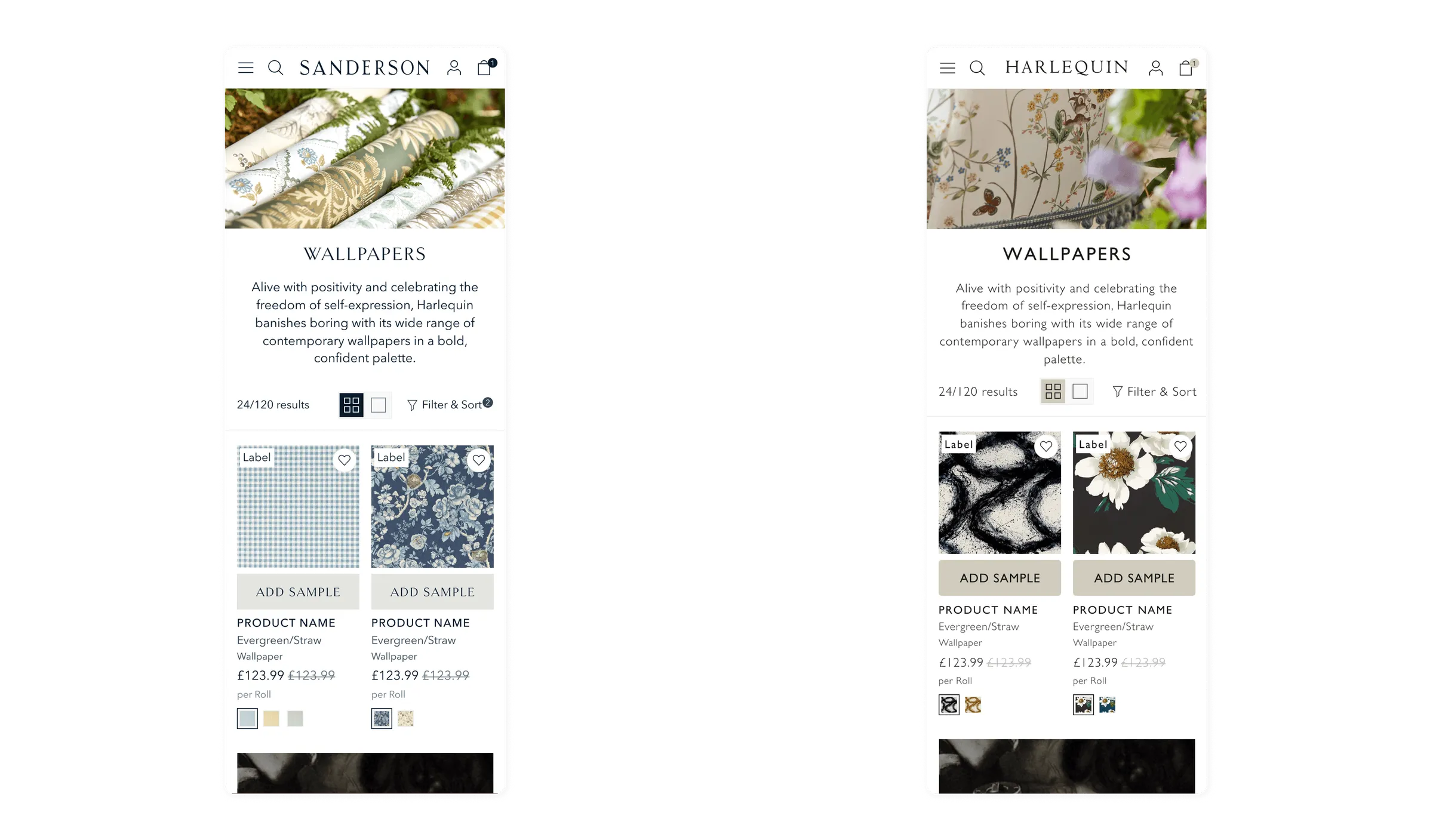
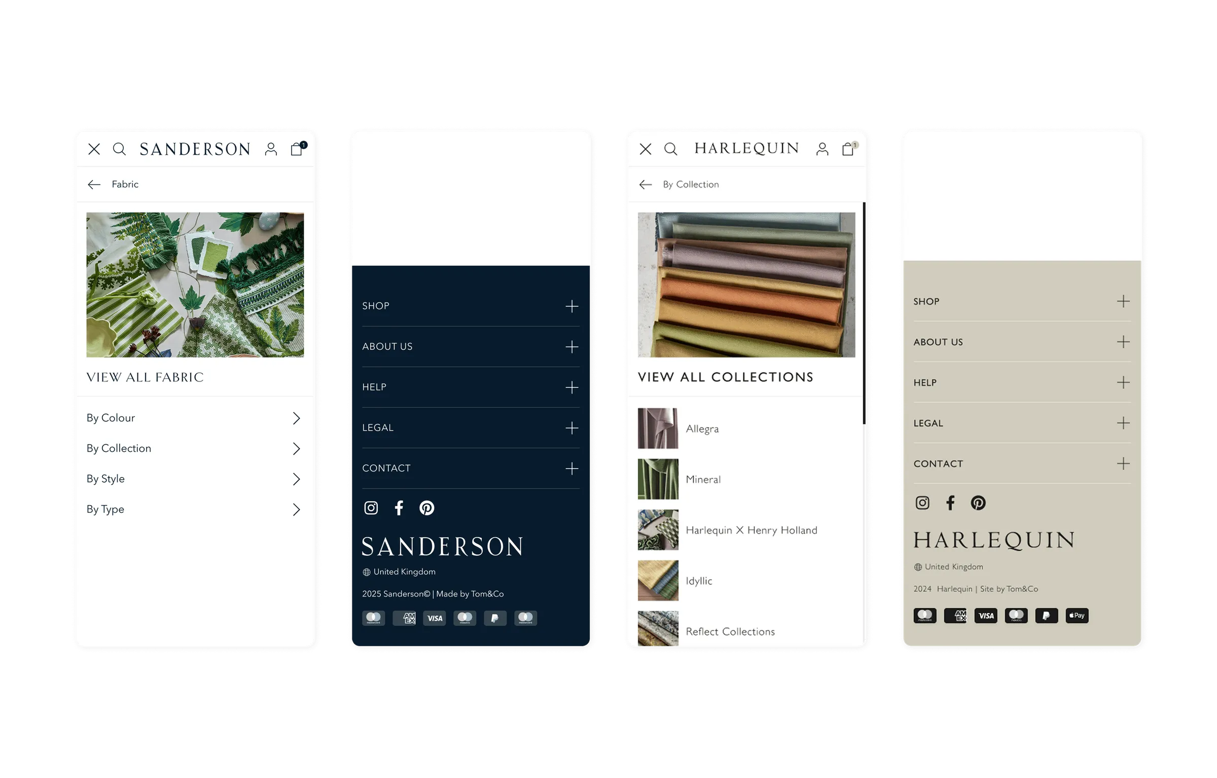
I built a single component library with brand-level theming on top. Sanderson and Harlequin are the first two expressions, and Harlequin is already live. The real deliverable was the structure underneath, so each future brand launch becomes a theming exercise, not a redesign.
Designing around the backend, not fighting it
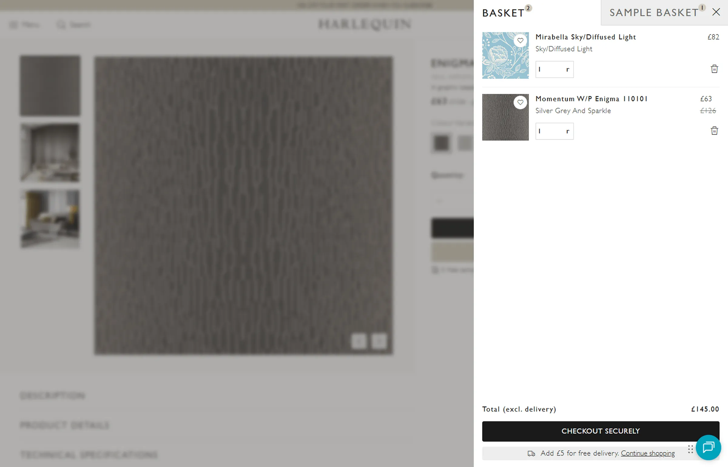
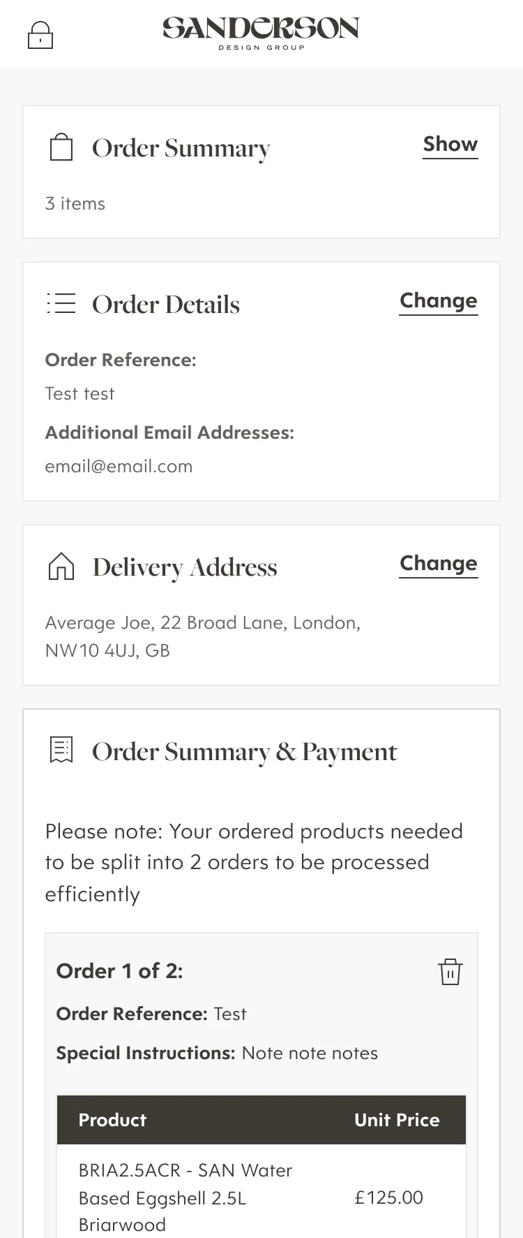
Samples are central to how people buy wallpaper and fabric, but the legacy backend couldn’t handle sample orders and real purchases in the same transaction. Rather than force a costly re-architecture, I designed a split basket. Samples and products sit side by side for the customer but check out independently behind the scenes. It was invisible to users and achievable for the dev team.
Navigation built around how people actually shop
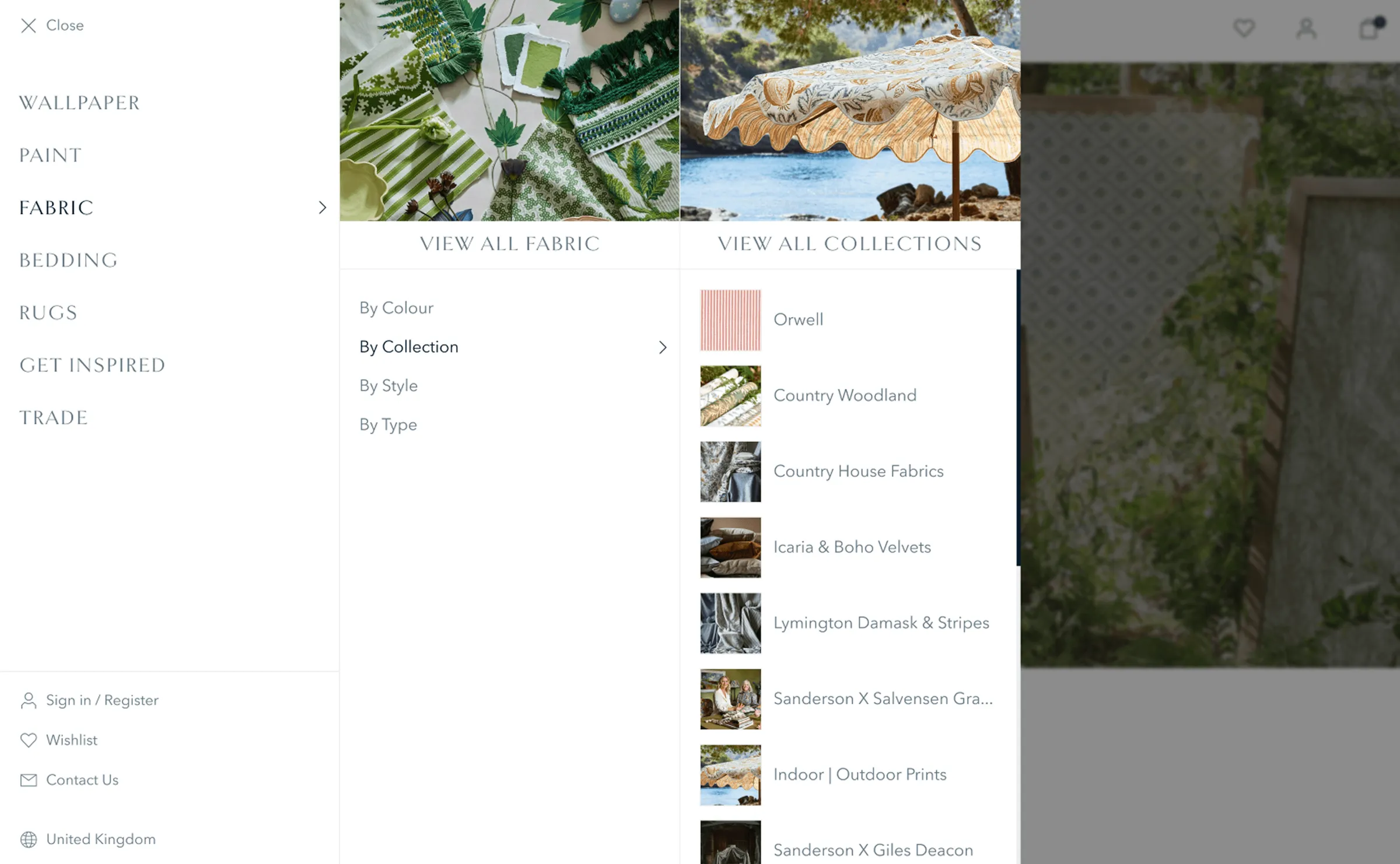
Customers rarely arrive knowing a product name. They’re looking for a colour, a room or a style. I designed “shop by” routes into the navigation so people can browse the way they think, not the way the catalogue is structured.
The Trade Hub
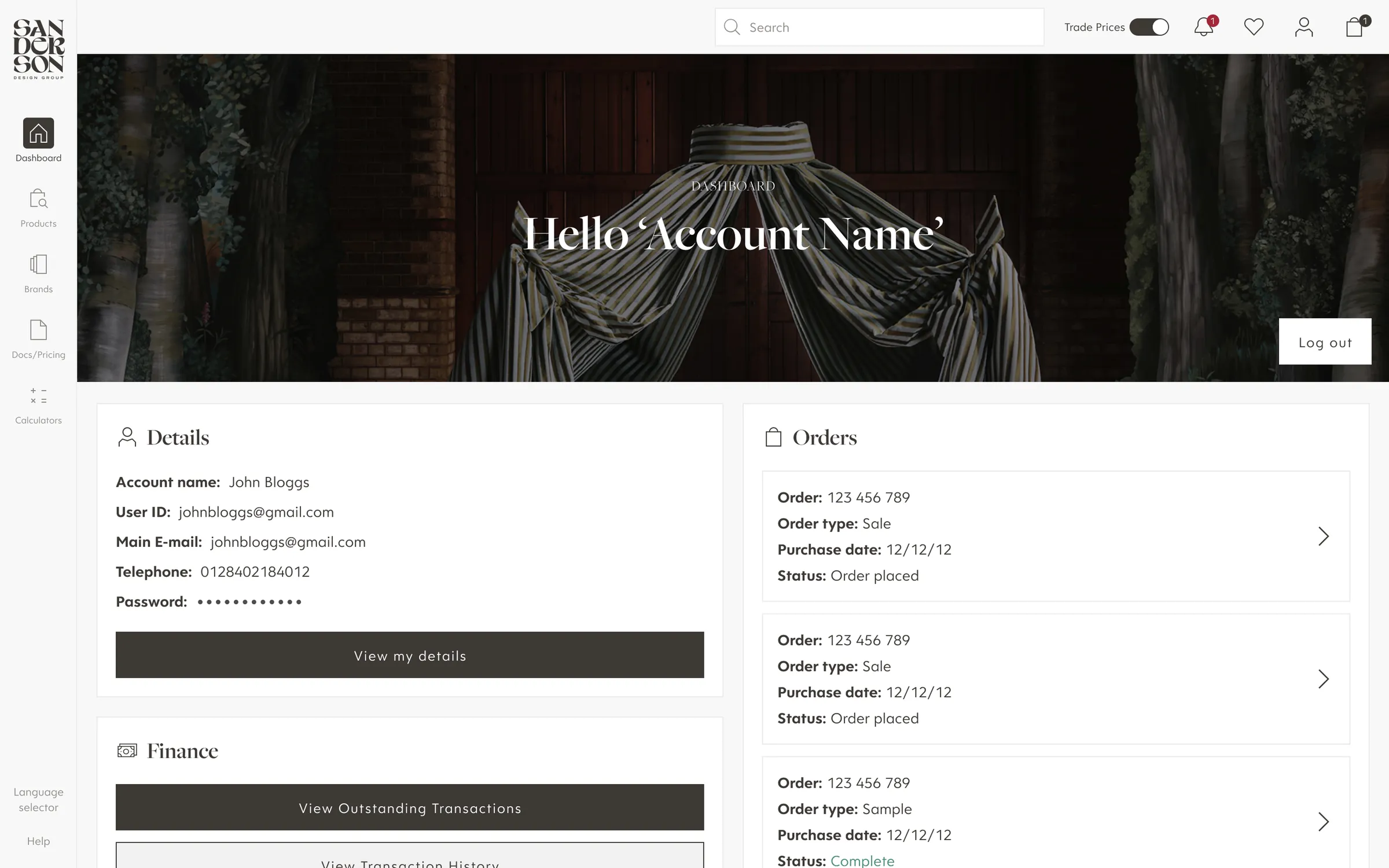
Trade customers have different jobs to do, so the hub was built around their needs rather than as a skin of the consumer sites.
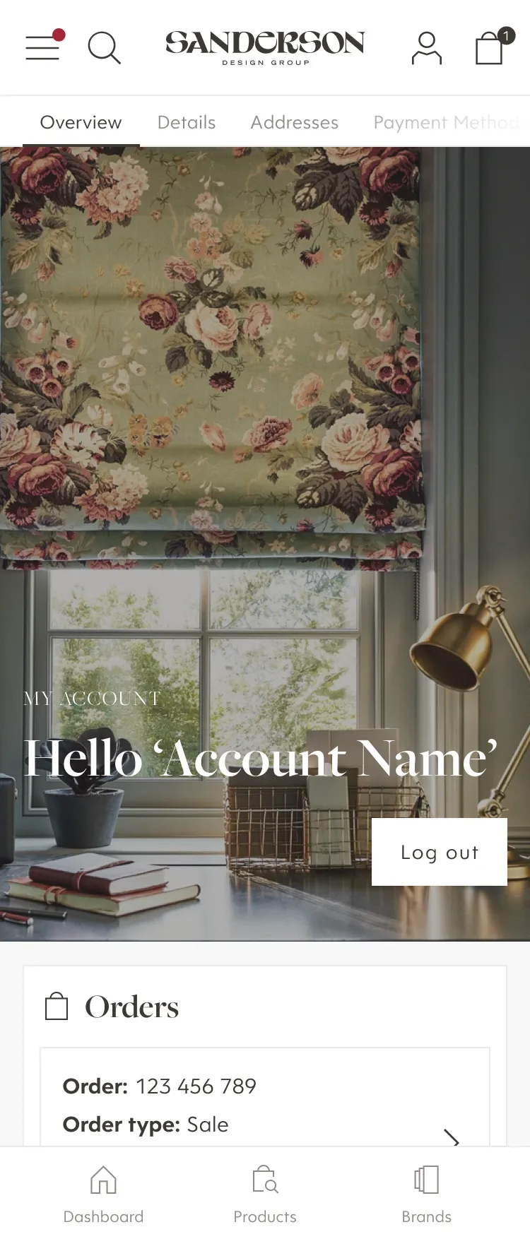
- One login, every brand. All the brands a customer has access to sit in a single account, with brand landing pages keeping each identity distinct.
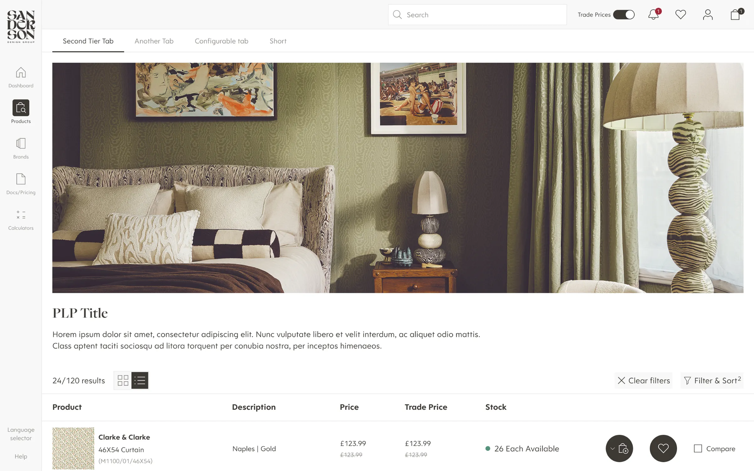
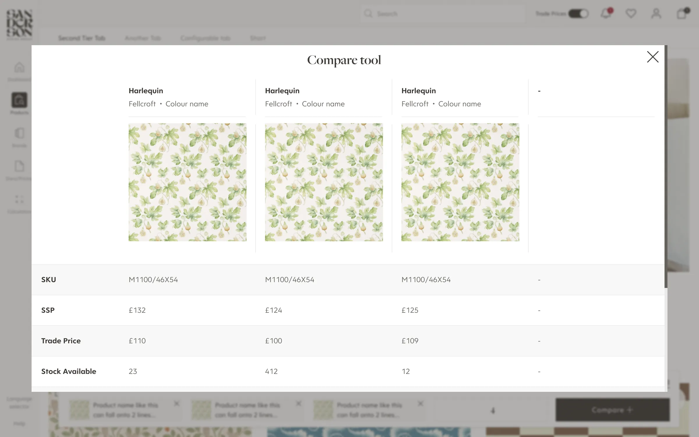
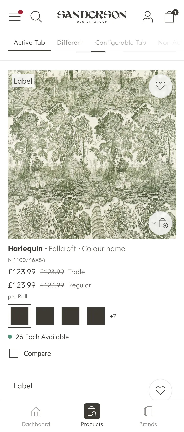
- Built for volume. A list view on product listing pages for fast scanning, bulk ordering, and a compare tool for specifying between similar products.
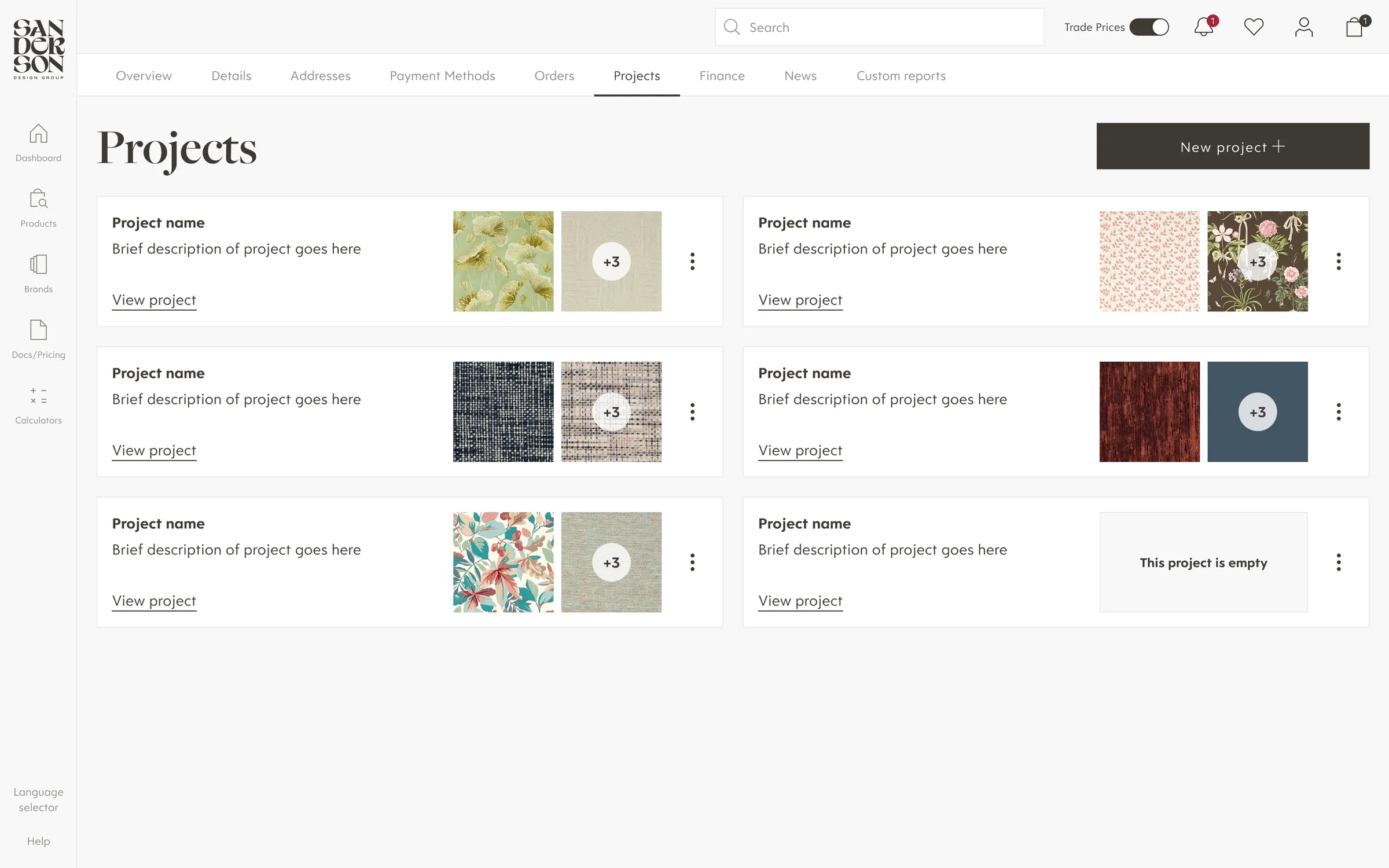
- Projects. Interior designers can group products by client, room or scheme, much like a wishlist but structured around how they work. They build a scheme once, then present it or order from it.
Outcome
The platform launched to industry recognition. It won Best eCommerce Replatform at the 2026 eCommerce Awards and Silver for Best B2B Website of the Year. Harlequin became the Group’s first D2C site, and the system underneath is now the blueprint for every brand launch that follows.