Topps Tiles
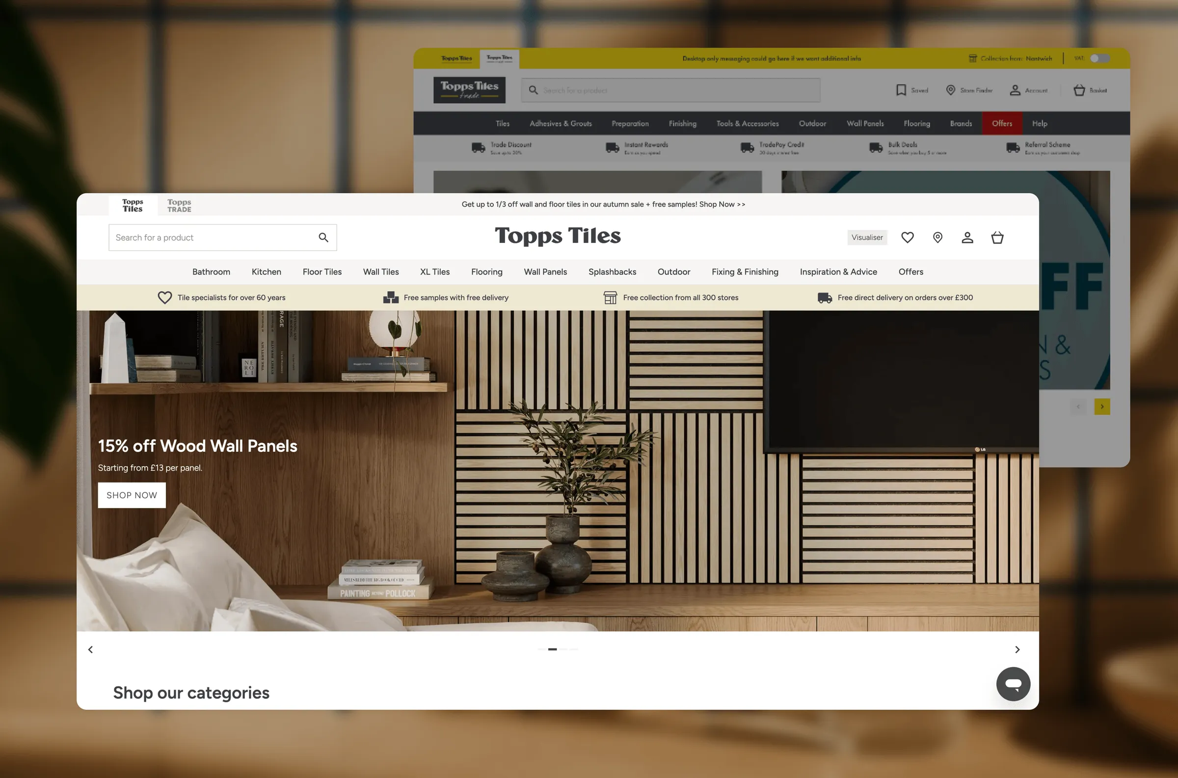
Making omnichannel logic simple for the UK's largest tile retailer.
- Role
- Designer: all UX, UI and design system work; prepared and co-ran client workshops
- Client
- Topps Tiles
- Agency
- Tom&Co
- Year
- 2025
- Scope
- Trade and Retail sites on one shared design system
At a glance
- 300+stores, with live stock tied to the customer's chosen store
- 2sites, Trade and Retail, running on one design system
- 1basket for mixed delivery and collection
- 35%improvement in conversion since launch, as reported by Tom&Co
The challenge
Tiling a bathroom is a multi-product purchase: tiles, adhesive, grout and trims. Those products often come from different places at different times. Topps runs over 300 stores alongside central warehouses, so what’s available depends on where you are and how you want it.
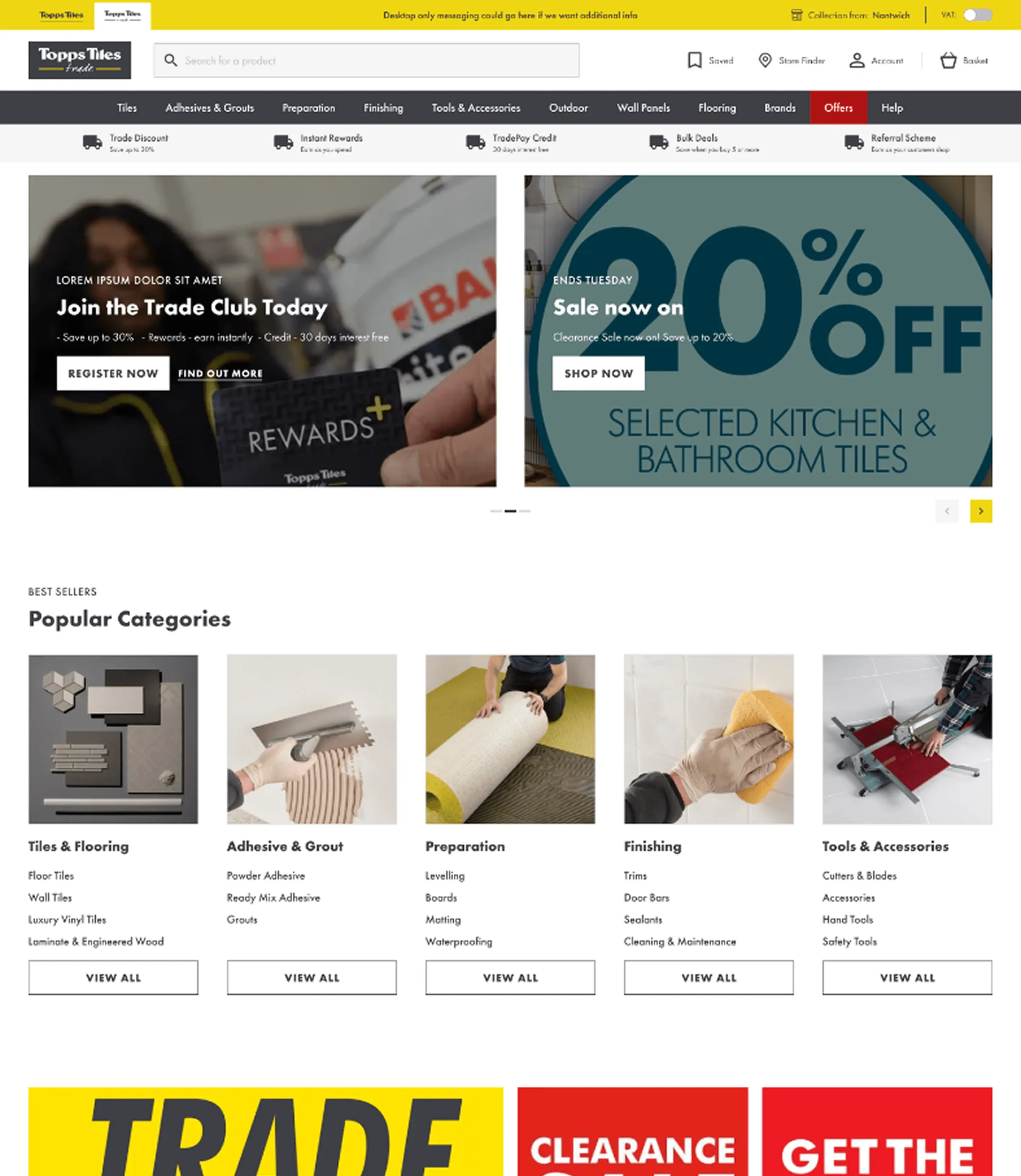
The old experience pushed that complexity onto the customer. The brief was to design two experiences on one shared system. Trade customers needed speed, account pricing and repeat ordering. Retail customers needed inspiration and a guided path to the right products.
Research and workshops
Our Head of Design led the client relationship. I produced the workshop materials, took part in the sessions and turned the outputs into the design. We worked with Topps’ e-commerce, trade and store teams to map how stock, fulfilment and pricing actually worked behind the scenes, then agreed a shared set of rules before any UI existed.
Key decisions
A split basket for mixed fulfilment
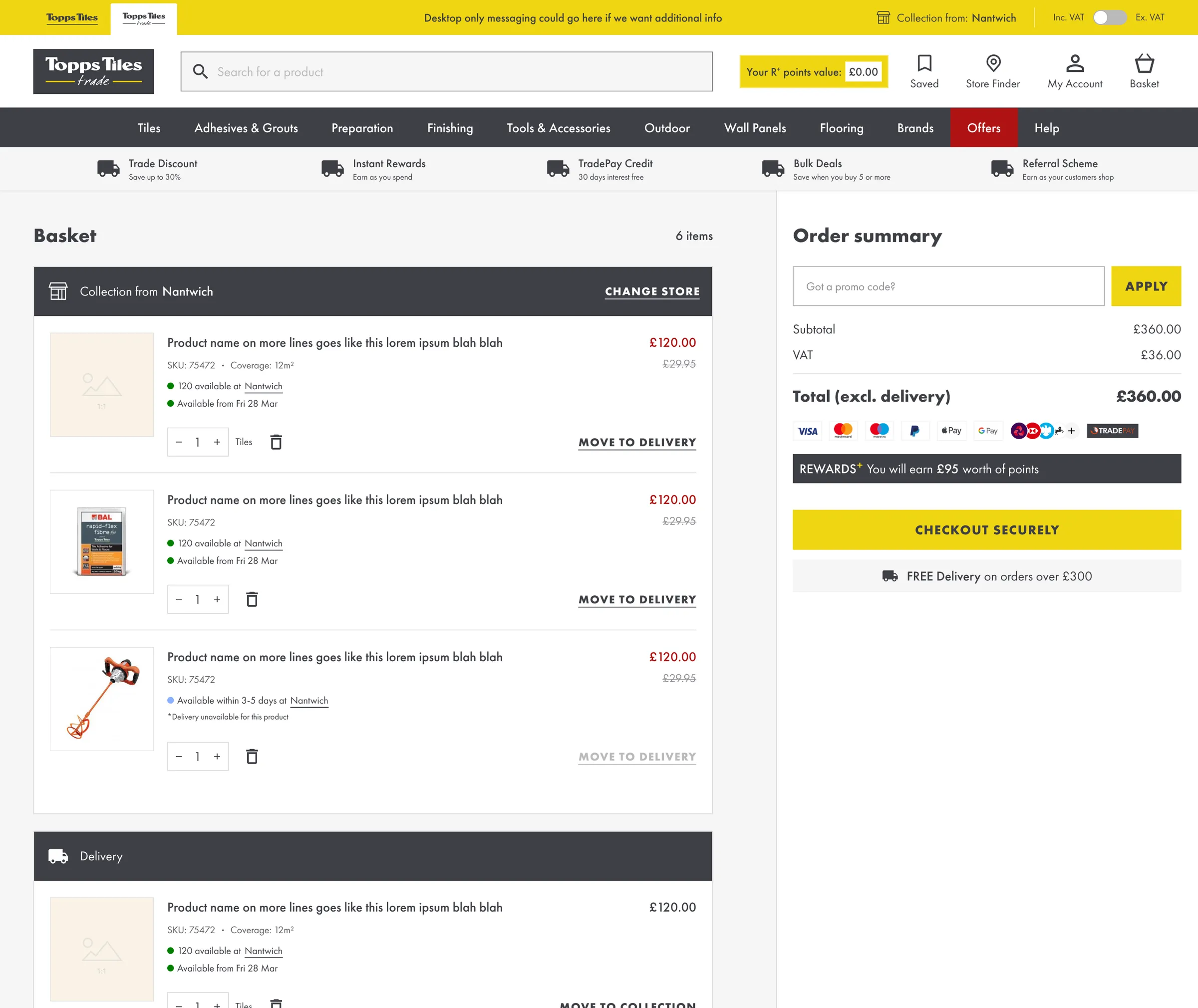
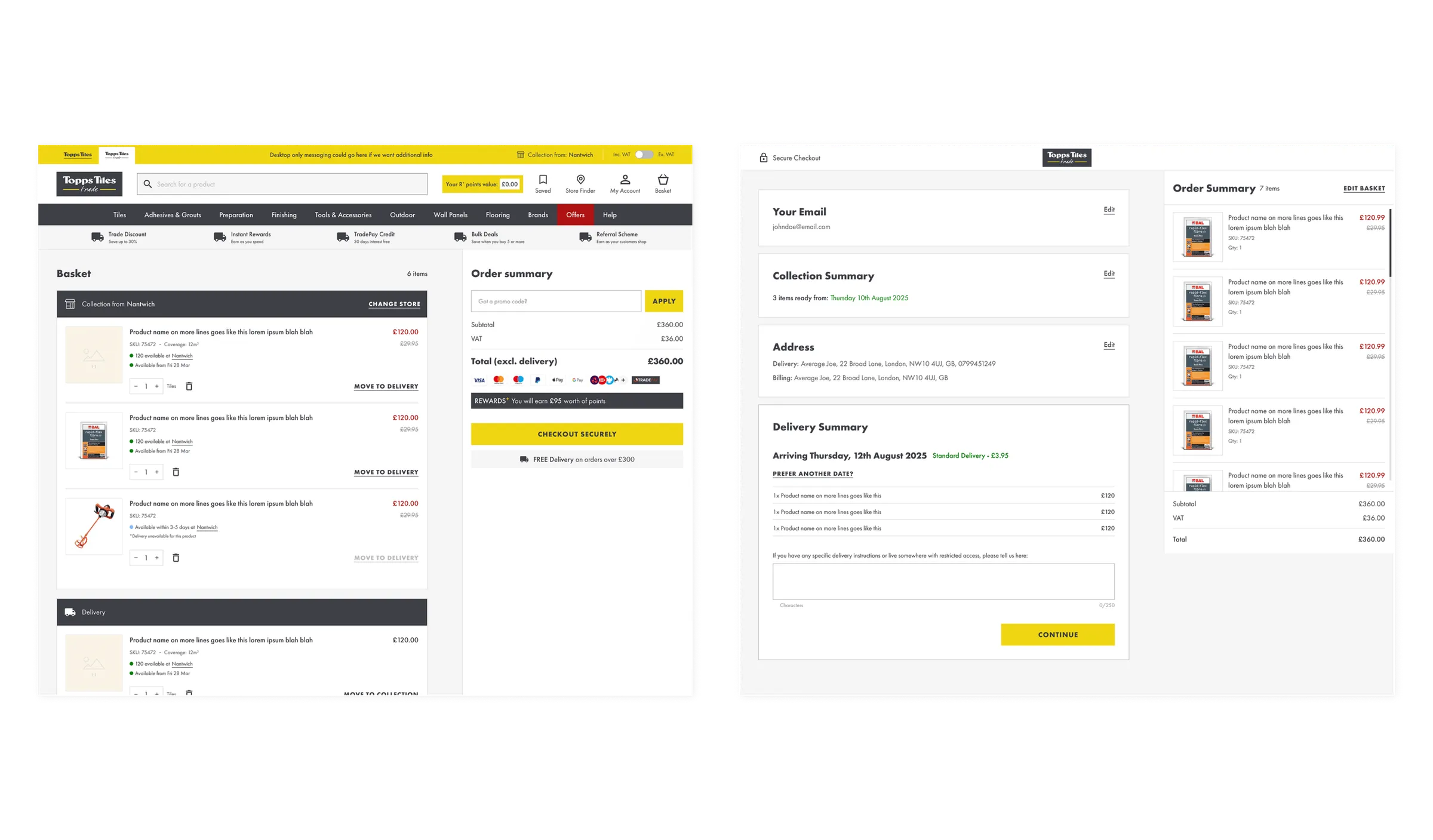
Customers can mix click-and-collect and delivery in one basket and one checkout, with each item clearly grouped by how and when it arrives. Without this, a customer whose grout is in store and tiles are in the warehouse has to place two orders.
Stock messaging tied to your store
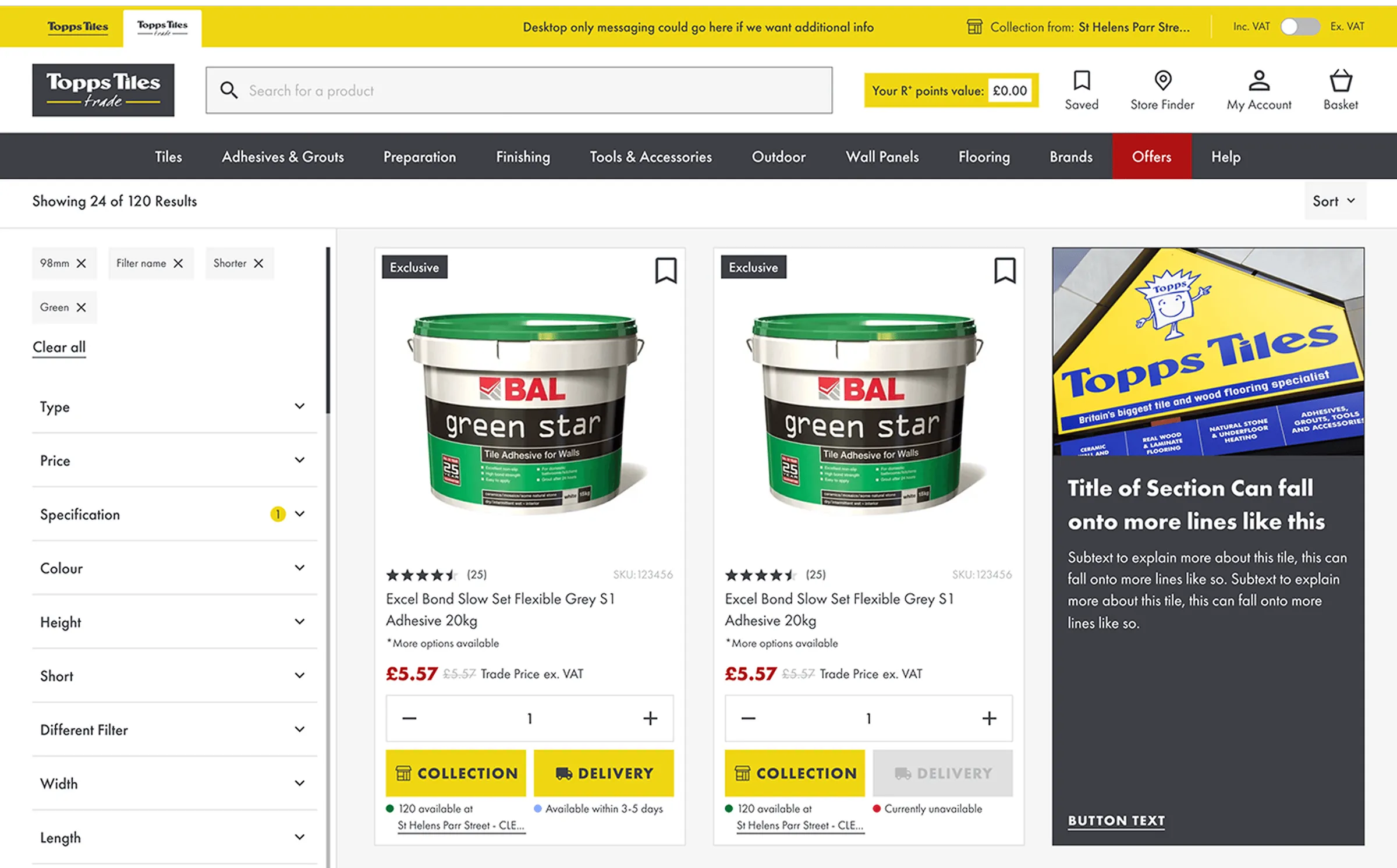
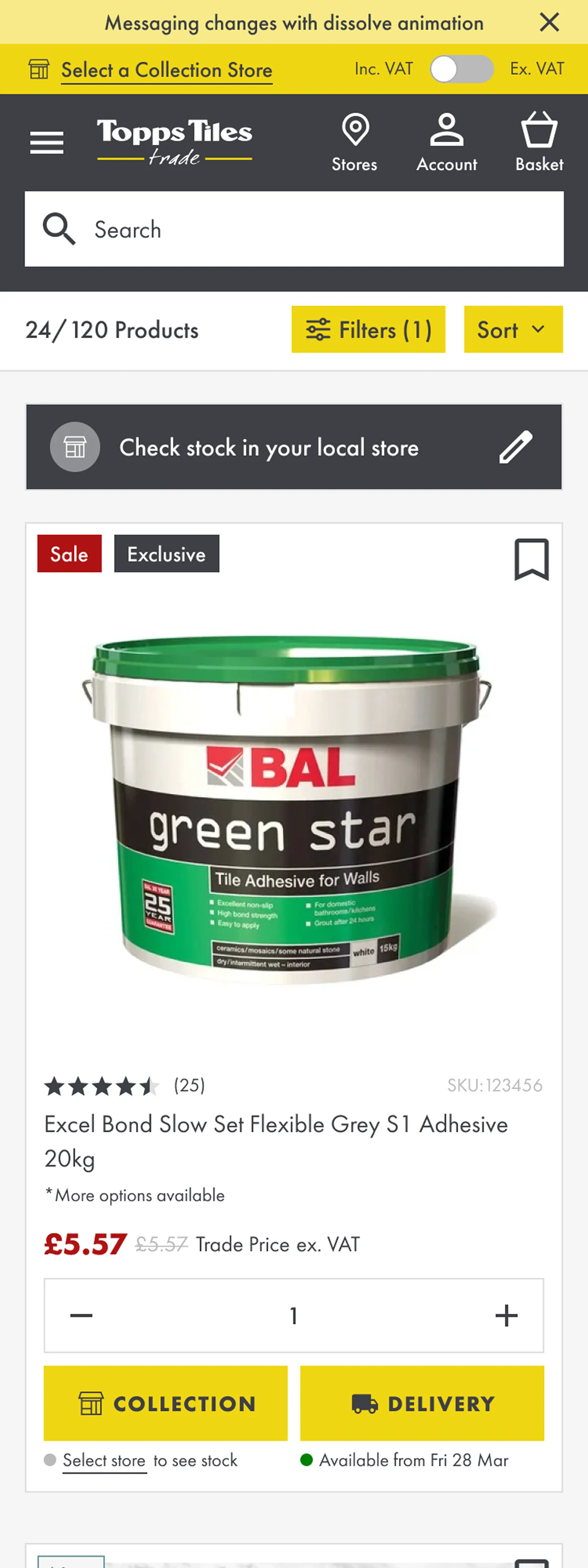
Availability was the hardest logic on the project. I designed four states, applied consistently from listing page to checkout: in stock, on the way, online order only, and out of stock.
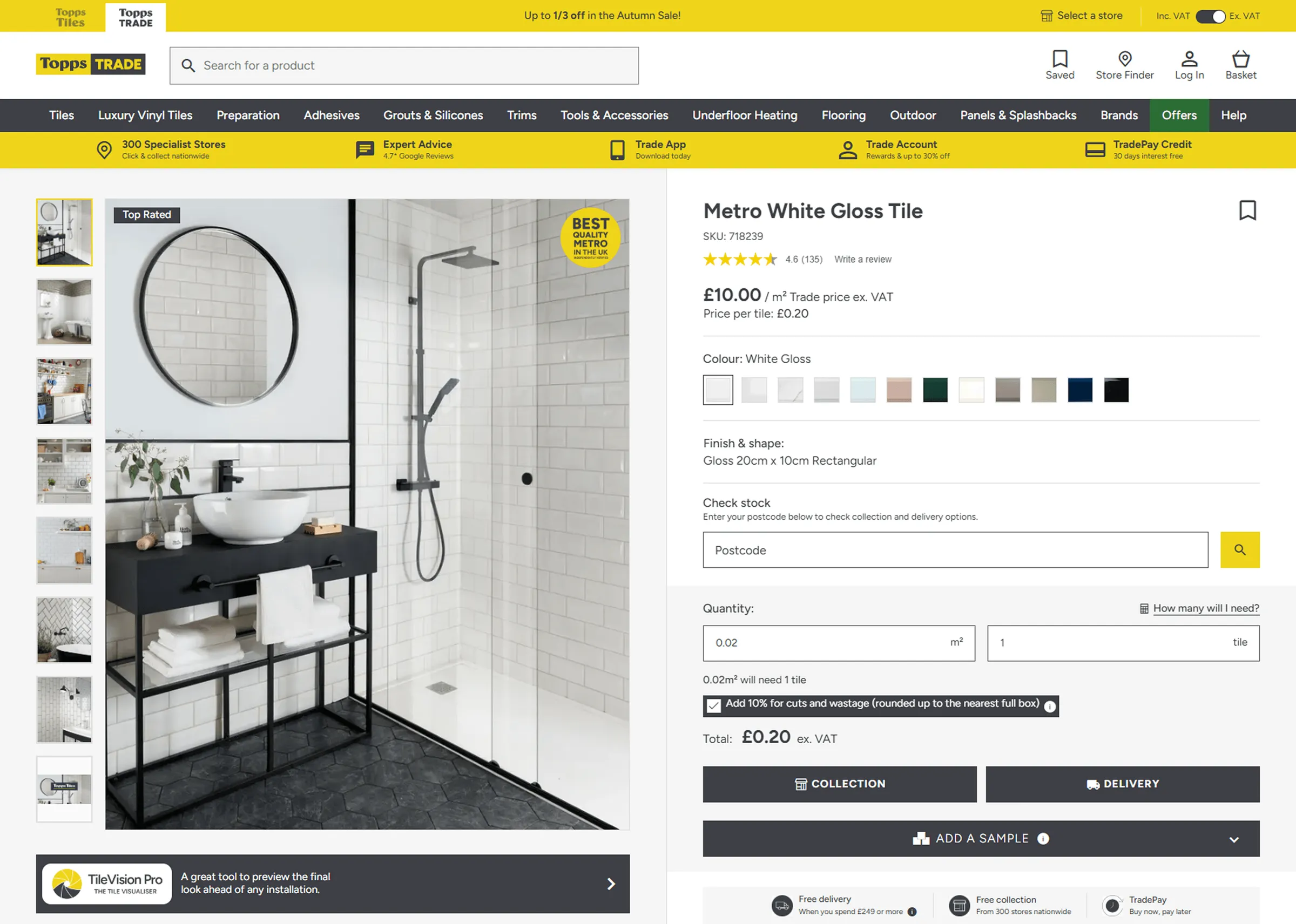
On the Trade site, every state is tied to the customer’s selected collection store. Changing the store in the header updates stock levels across the whole site, so a tradesperson sees what they can collect locally and what can be delivered, not a national figure that doesn’t apply to them.
One system, two temperaments
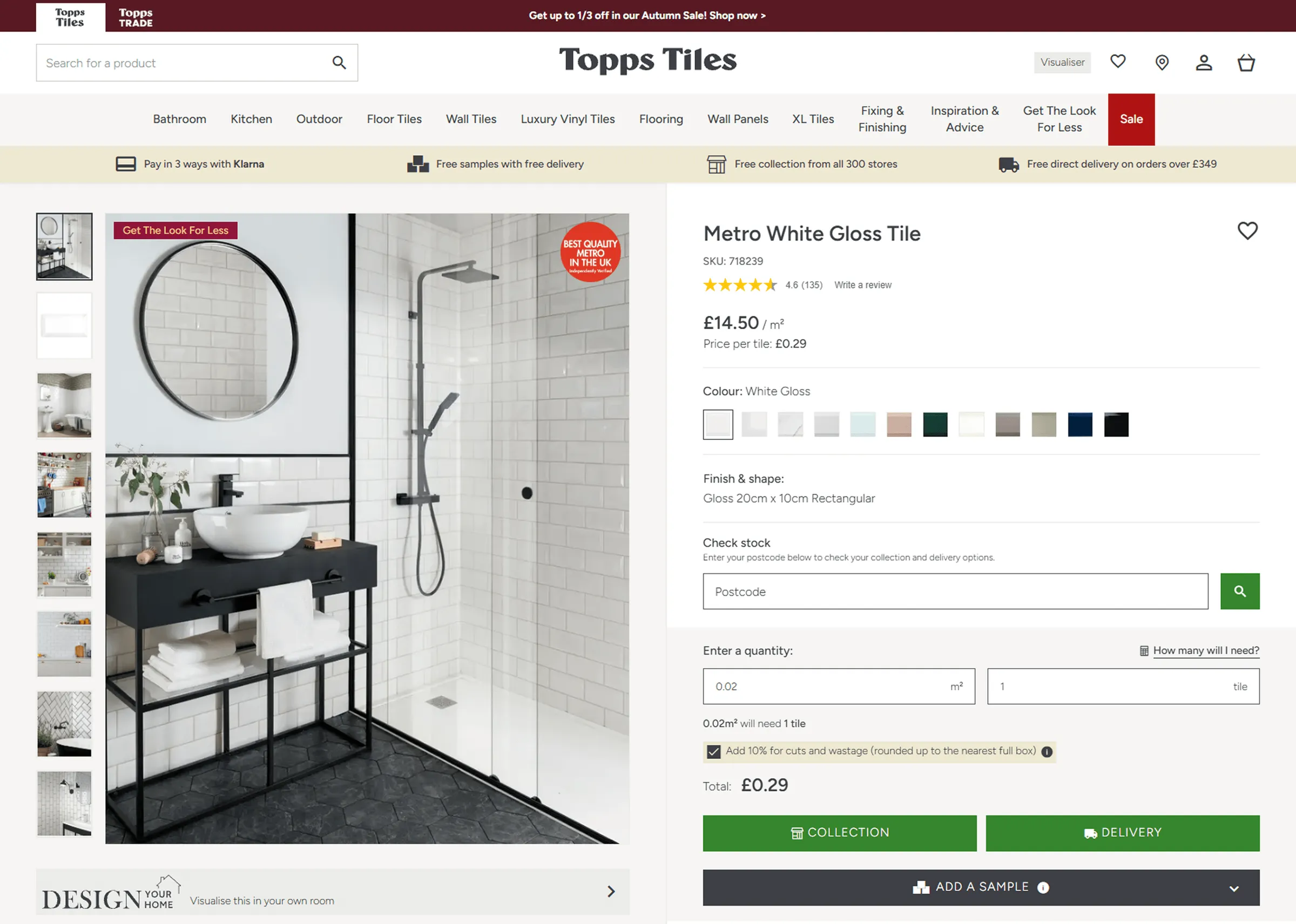
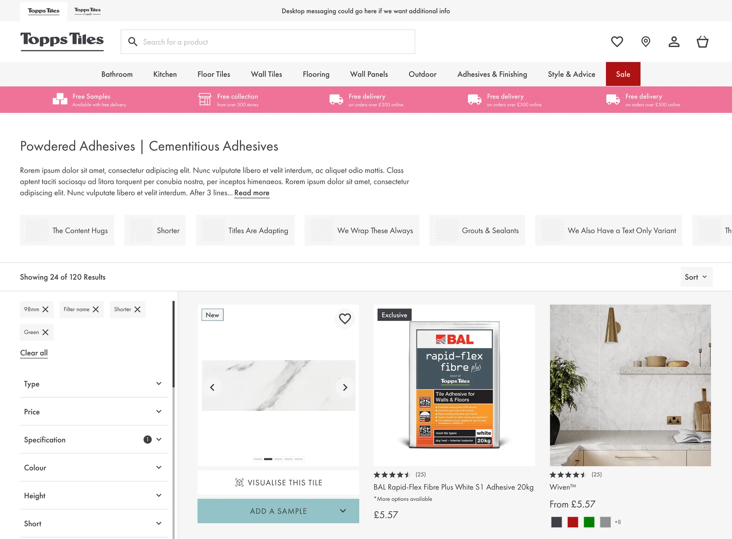
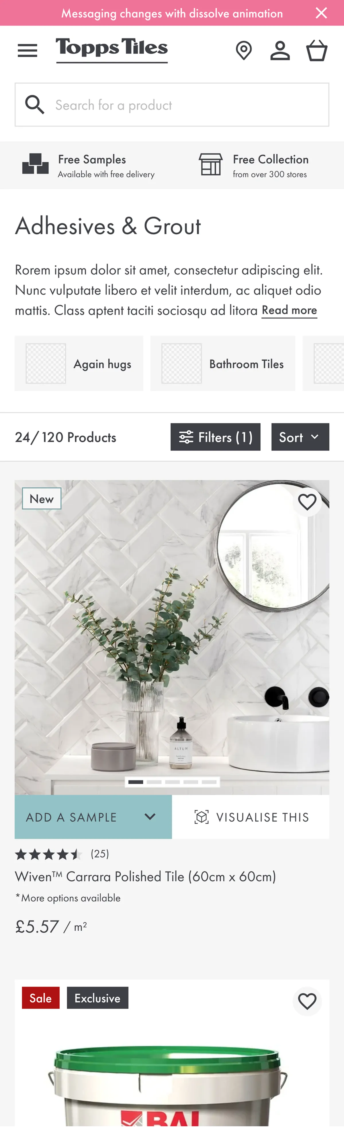
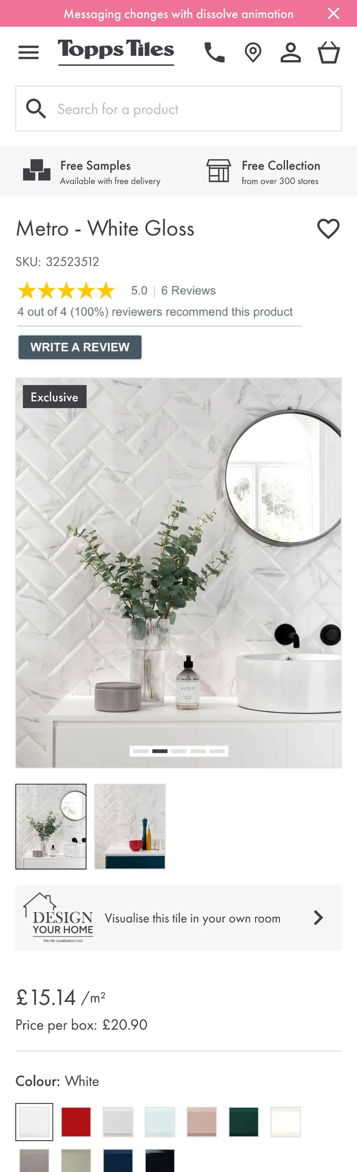
Trade and Retail share every core component but are tuned differently. Trade has denser layouts, account pricing up front and fast reordering. Retail has larger imagery, room inspiration and an easy path to samples. That’s one codebase to maintain, with two experiences that each fit their audience.

Making loyalty points impossible to miss
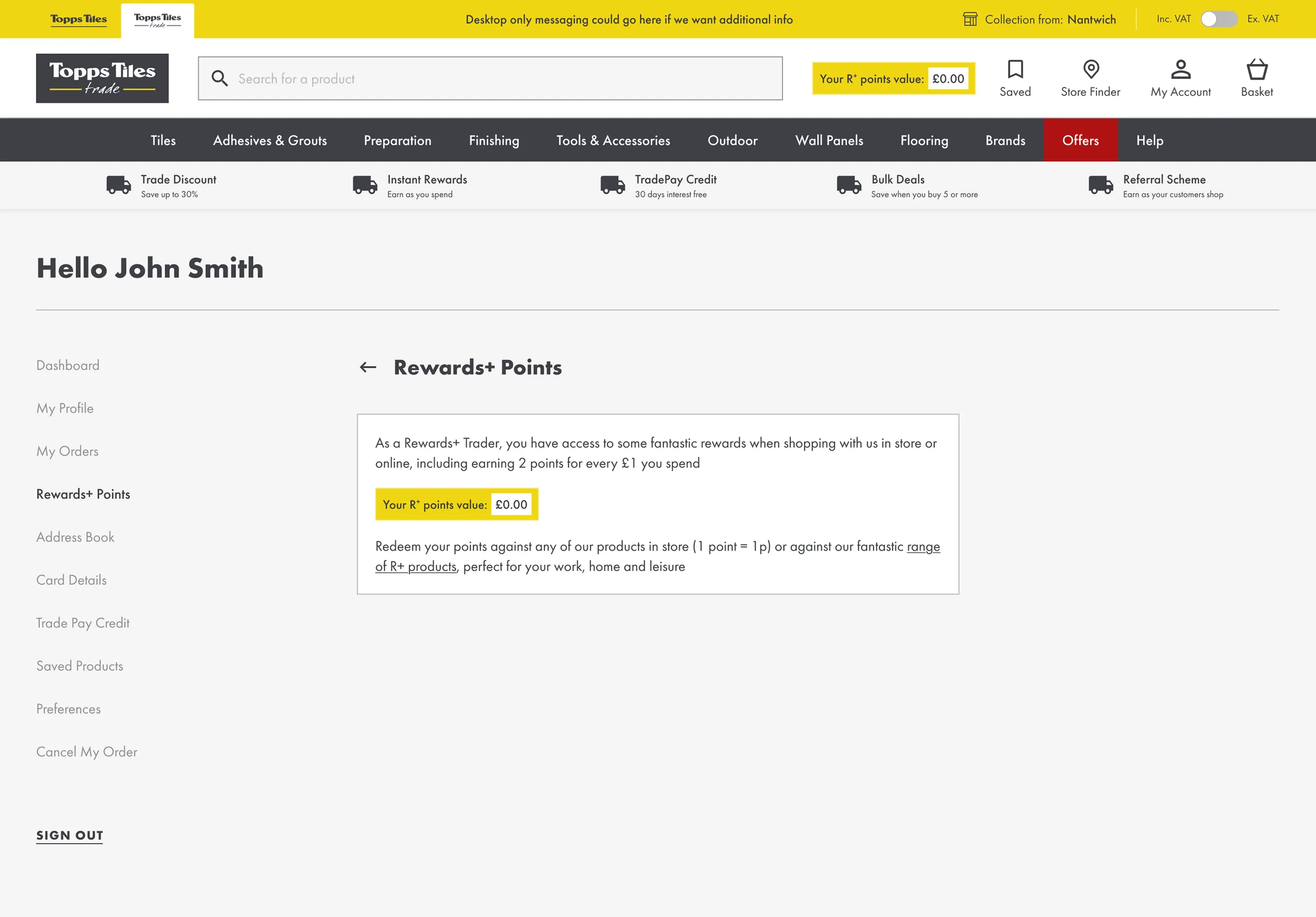
Trade customers earn points on every purchase, but a loyalty scheme only works if people know what they’re earning. I surfaced points at every stage of the journey:
- Header and account: the running balance is always visible.
- Product page: shows how many points the product earns and what that’s worth in pounds.
- Mini basket and basket: show the points total for the order before checkout.
Showing the monetary value turns an abstract number into a reason to choose Topps over the merchant down the road.
Outcome
Both sites launched on the shared system. Trade customers got a faster, account-led ordering experience. Retail customers got a more inspirational, easier-to-shop site. The modular system has made later rollouts quicker and more consistent.
Tom&Co reports a 35% improvement in conversion and a 50% increase in online trade orders since launch.